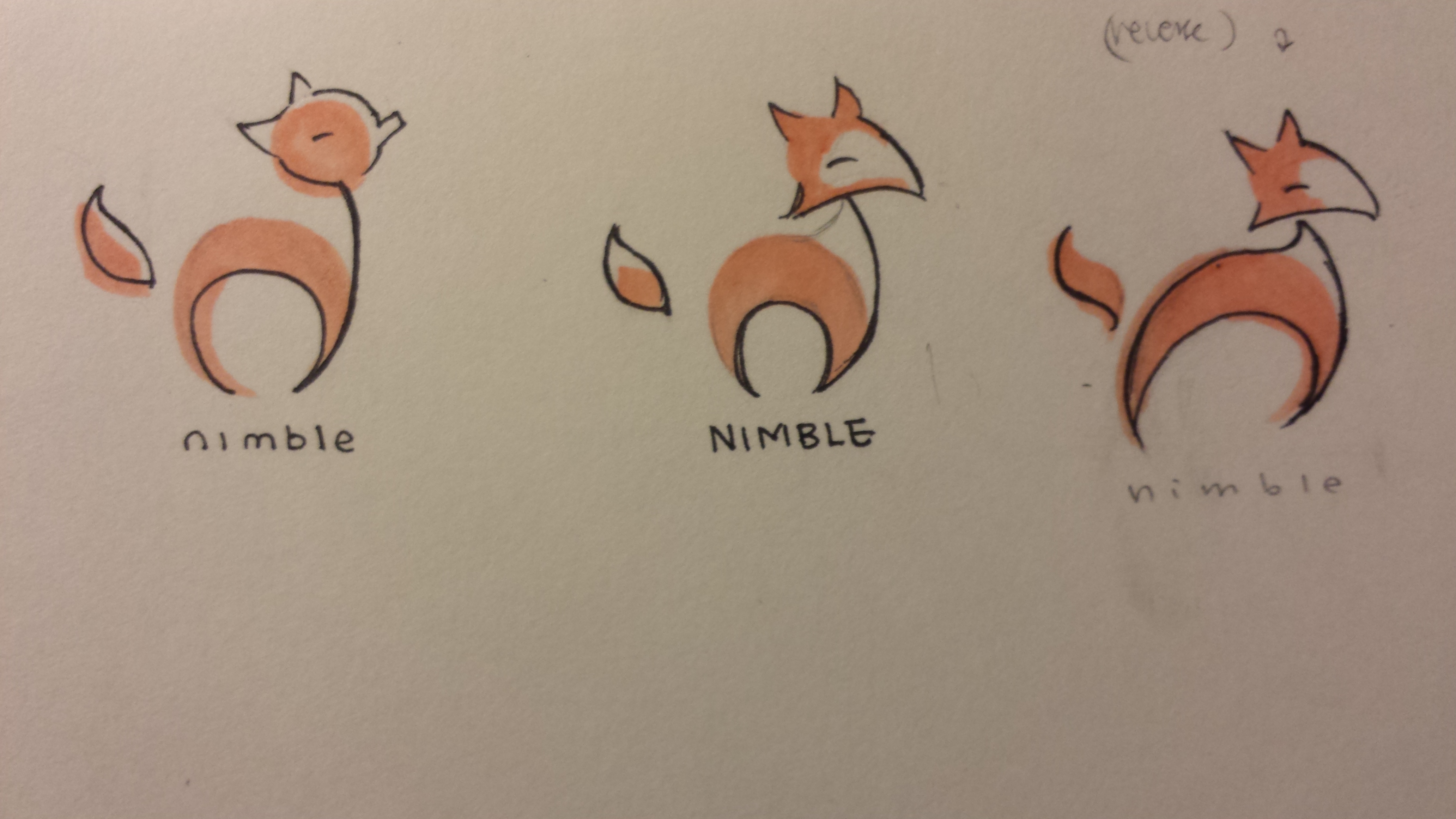
All works (fall 2015 - spring 2016)


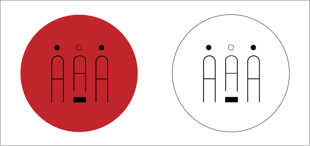
The logo design went through several variations, as shown above. While I ended up going with the simple black and white version (due to its versatility), I did play around with giving it color accents and other splashes of color. However, because the red design looks too much like the Japanese flag and AAA is an all-inclusive organization, I eventually scrapped the idea.
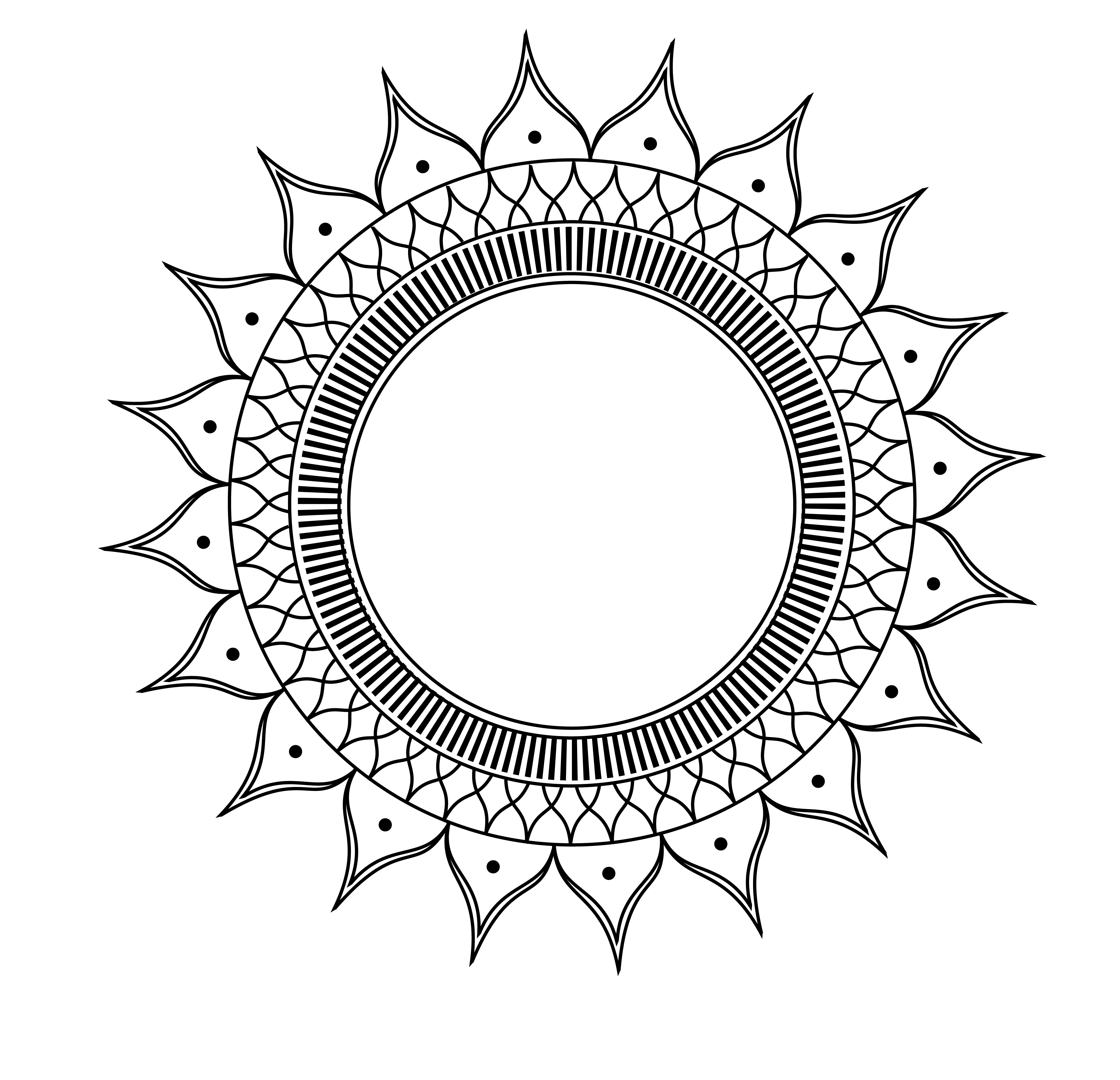
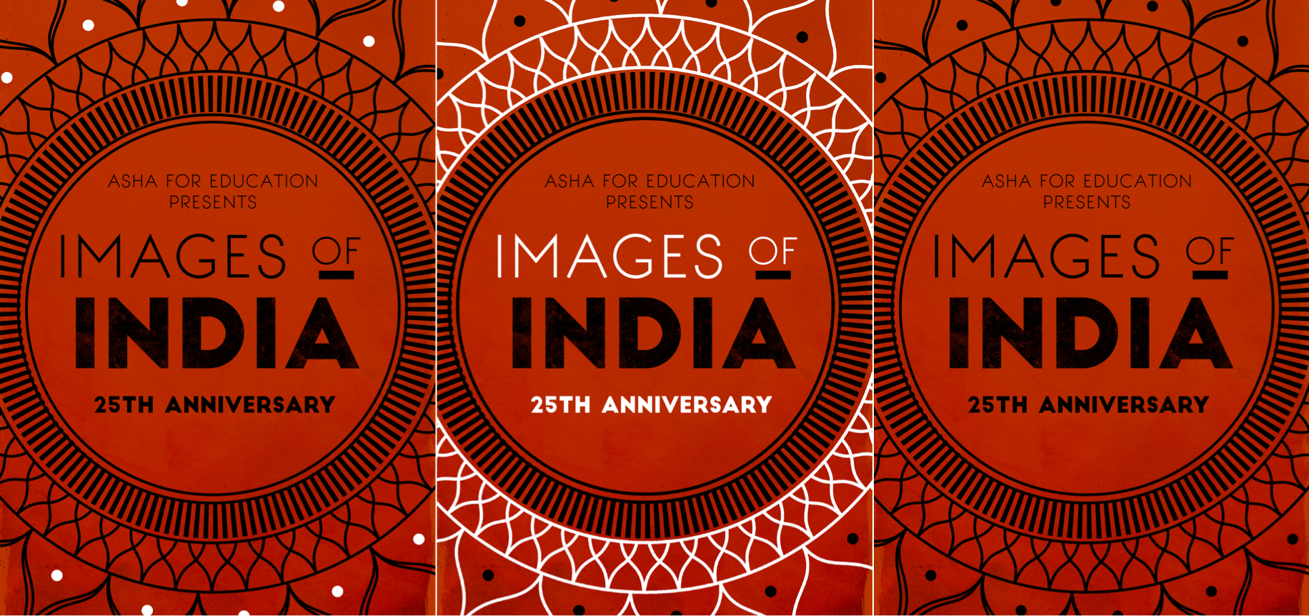
This design plays with traditional Indian patterns, specifically the mandala. I created a simple circular design in Illustrator and overlayed the images on top of a watercolor texture to give the poster a handcrafted feel.
Red and white are the core colors of the poster. Red, for its ubiquity in Indian culture, as well as its association with action, marriage, spices, and fertility. White, for its associations with peace and purity, and for being complimentary to red.