Branding and graphic design
Tokiha aims to teach Japanese high school students to value skills and concepts not traditionally included in Japanese school curriculums like problem-solving on a global scale, creative thinking, and leadership skills.
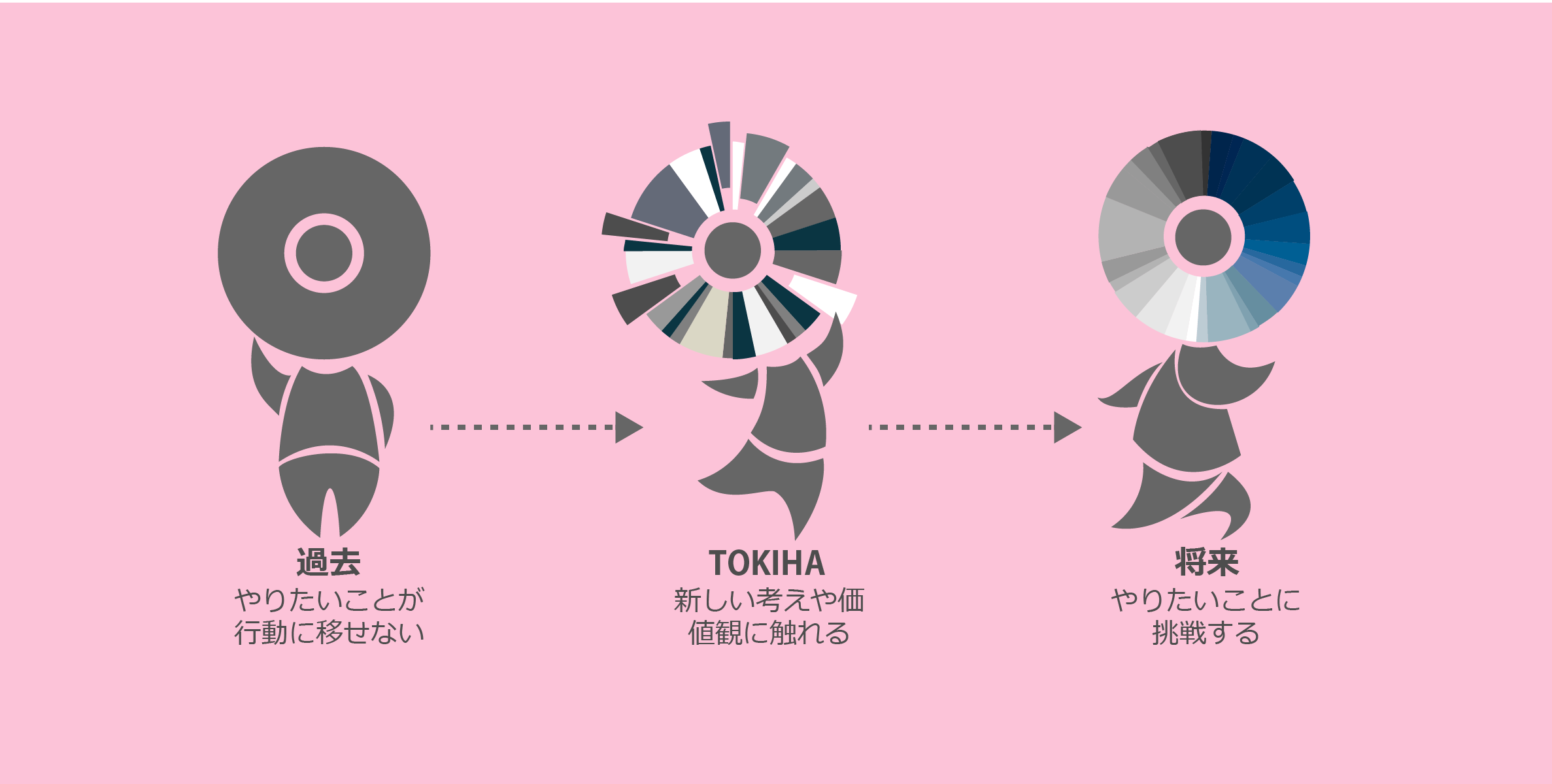
Its name comes from the Japanese phrase "tokihanatsu," which means "to release." With this in mind, I wanted to create a graphic that expressed freedom of thought, coming together, and broadening one's horizons.
This design's strengths are its balance, simplicity, and modern look. However, these strengths are also its greatest weaknesses, as they make the desogn more suitable for a clothing brand or consumer product. It lacks the playfulness needed for a summer camp.
I created this one with the aim of representing Tokiha's mission of fostering cultural exchange and encouraging Japanese students to think about their place in the world and how they would interact with and change it. The center is a visual abstraction of the world (or the mind), while the pieces are indicative of knowledge, cultures, collaboration, and new ideas.
We ended up choosing this design for its flexibility, abstract design, and potential to be both playful and serious at the same time.